1/14/10
1/13/10
1/4/10
Namco's Visual Arcade History
Just finished a personal infographics project I was working on for a little more than a month. I actually like it!
I've also posted it on flickr with more details.
I've also posted it on flickr with more details.
12/26/09
12/21/09
Drawings yeah!
I just learned about some comics!
Octopus Pie, about two girls who become roomates. I like this one - one girl looks like Marjane from Persepolis and the other looks like Scott Pilgrim.
Bakuman, about two high schoolers who decide to write manga. It's by the Death Note team. Looks pretty good so far.
I'm still an Achewood fan, too.
Octopus Pie, about two girls who become roomates. I like this one - one girl looks like Marjane from Persepolis and the other looks like Scott Pilgrim.
Bakuman, about two high schoolers who decide to write manga. It's by the Death Note team. Looks pretty good so far.
I'm still an Achewood fan, too.
11/30/09
Design Inspiration: Mark Weaver
11/3/09
That's one way to get...ahead...
11/2/09
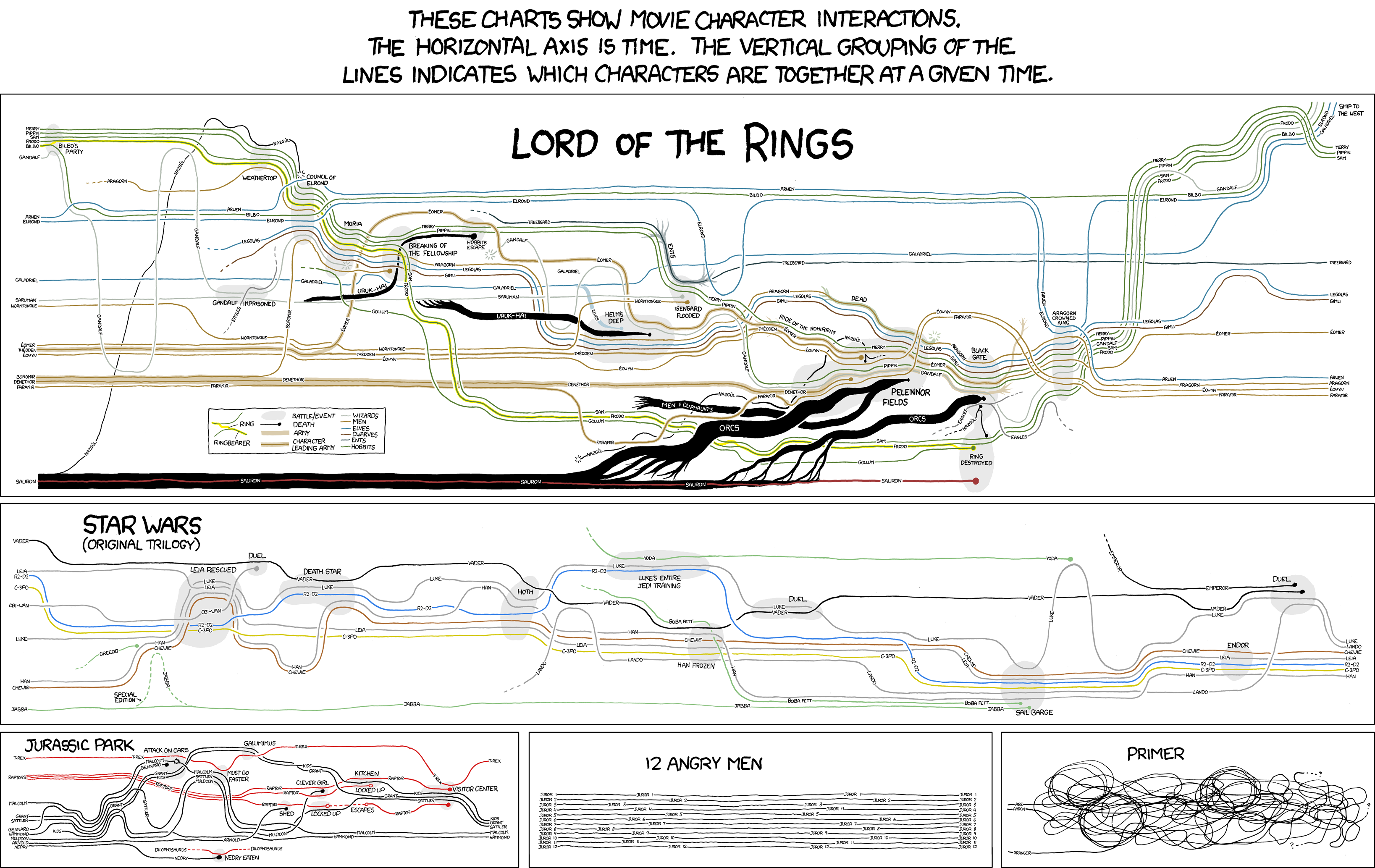
Drawn Infographics
XKCD's drawings of character interaction charts are amazing. The hand-drawn quality gives it more life I think.
10/20/09
3D Dot Game Heroes
An old-school Zelda parody with 3D sprites. The best thing is that the light and depth-of-field tricks make the sprites look "real."
Wow. This game is adorable.
Wow. This game is adorable.
10/17/09
How Children Fail
http://en.wikipedia.org/wiki/
I wish I had this book when I was like, 10. I especially like the stuff about how teachers can sometimes make children afraid to take challenges in school (or life) because of an instilled fear of failure:
They fear wrong answers and shy away from challenges because they may not have the right answer. This fear, which rules them in the school setting, does their thinking and learning a great disservice. A teacher’s job is to help them overcome their fears of failure and explore the problem for real learning. So often, teachers are doing the opposite — building children’s fears up to monumental proportions. Children need to see that failure is honorable, and that it helps them construct meaning. It should not be seen as humiliating, but as a step to real learning. Being afraid of mistakes, they never try to understand their own mistakes and cannot and will not try to understand when their thinking is faulty. Adding to children’s fear in school is corporal punishment and humiliation, both of which can scare children into right/wrong thinking and away from their natural exploratory thinking.
Also, Pelican/Penguin book covers are quite nice.
10/7/09
I'm making a font
Tentatively named "3.5" since it's inspired by floppy disks. I used Illustrator and most of it is done, but I'm testing it out before I try to use Fontstruct or something to make it usable.
9/29/09
9/28/09
Funny Games poster
I must have seen this poster at Apple's trailer site or somewhere. Anyway, it caught my eye back when I saw it and actually got me to check out the trailer, and later the movie.
The design is really striking, I think. Really simple and tight grid-based typography. I love Naomi Watts's expression, and the tears streaming down her face foreshadow some heavy shit about to go down. And it does
The design team, Crew Creative Advertising, does really good stuff with close-ups in other posters as well! Didn't realize how much of their stuff I would recognize.
9/22/09
Design Inspiration: Siggi Eggertsson
Through my usual design-blog-hopping I learned of Siggi Eggertsson, a freelance illustrator and designer from Iceland. I like that he can apply his abstract, pixel-like design aesthetic to anything and it comes out beautiful.


9/3/09
Design Inspiration: Stefan Kanchev
Stefan Kanchev (1915–2001) was a Bulgarian graphic designer with an amazing track record of stamps, postcards, labels and beautiful logos. I had never even heard of him or seen his work, and never realized how prolific his work was (thanks grain edit!), so it was a big surprise to see such an impressive collection of geometric logos and colorful designs that bring to mind those of Paul Rand and other well-known graphic designers.
http://stefankanchev.com/en/

http://stefankanchev.com/en/

Subscribe to:
Posts (Atom)


