3/29/10

Design Inspiration: Superbrothers

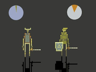
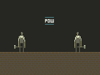
I've taken way too long to post about Superbrothers, a pixel artist from Canada. I remember falling in love with the look and feel of his videos when I discovered his website last year. His characters are very abstract but he still maintains a high level of detail, and the animation is incredible.

I looked to Jordan Mechner‘s Prince of Persia and Eric Chahi‘s Out of this World as well as the original Super Mario Bros, and I began to make some discoveries of my own. I began to avoid curves and outlines, deploying ‘jaggies’ carefully, keeping the focus on carefully calibrated fields of color and a sparse approach to pattern and texture. I experimented with less cumbersome stick-limbed pin-headed pixel rigs, which has since become my aesthetic preference. Eventually I began to see a distinct style develop – it seemed fresh, clean and absolute.

Website
Twitter
In-depth interview at 8-bit Today


DOT MATRIX REVOLUTION from superbrothers on Vimeo.


DESIGN REBOOT HD from superbrothers on Vimeo.

"sword" S:S&S EP @ GDC 2010 from Superbrothers: Sword & Sworcery on Vimeo.

3/21/10

MD Wine Festival poster entry

I recently entered a poster contest for the Maryland Wine Festival.

I went with a "wine pouring" theme here, with the colors going from red to white wine. The green background is supposed to bring to mind spacious vineyards or whatever.  Surprisingly, I like how it came out, despite the fact that I crammed the night before :P

3/13/10

CO-OP logo update

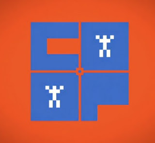
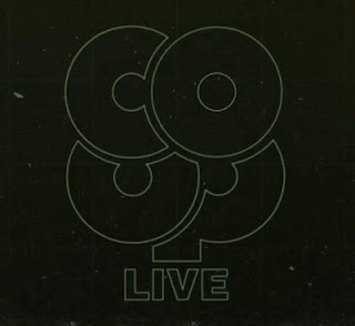
CO-OP, a show about videogames, recently went to a live format and with that started using a new logo! Even better, it was designed by the creator of Fez, a game I blogged about way back when.


Old


New


Matt Chandronait explains:

Why is this logo new/old instead of just new? Because it's what indie game designer Phil Fish originally came up with wa-hay back in the day when we were first slapping our show and our business together! 

That original CO-OP logo was deemed by some powers that be that it wasn't "gamer" enough, but we've always had a soft spot in our collective heart for it and with the launch of a show that will hopefully involve you as much as it does us, it honestly felt more fitting.

It's really awesome, and it's interesting that this "new" logo was actually created first and they liked this one all along. Even though their first used logo is really creative, this one is much more so! I love its rounded, unified clover-like form. All the letters just fit together perfectly.

3/11/10

Design Inspiration: souloff

I can't find much information on souloff, but she has an awesome body of work online. She manages to make vector art look like it was sketched out with Sharpies. Looks inspired by fashion design too - the line work is really carefree.

Website
Blog
Twitter